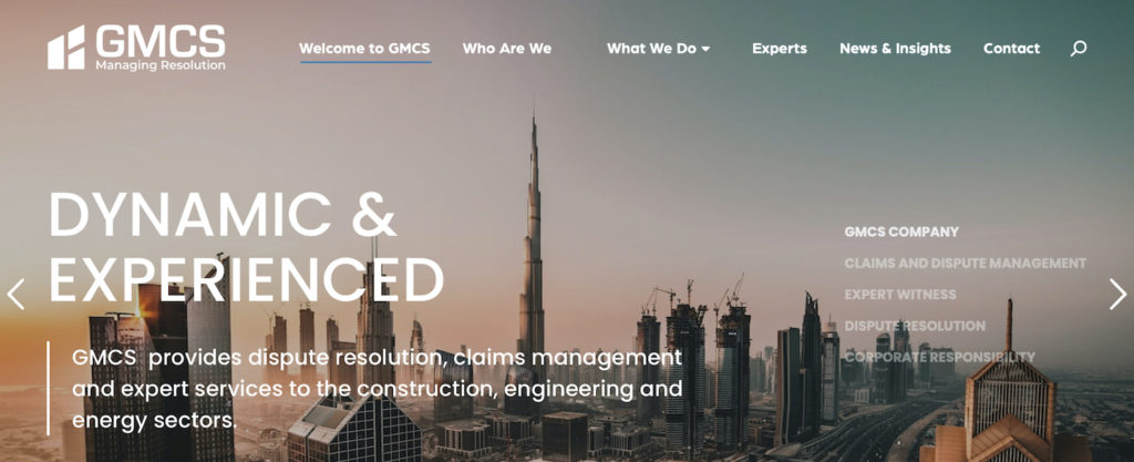
Welcome to our new corporate website with a new logo and evolved brand identity.
We are thrilled to unveil our new website, with a new corporate re-brand and a refreshed company logo design for 2021. After thorough research and talking with our partners and clients, we felt that this was an important step, due to the evolving digitalisation of business over the past 12 months. We view being current, being relevant, and forward-thinking as critical to maintaining and developing new client relationships.
Over the last year, we have worked hard to create a new image that defines who we are and how we service our clients, whilst maintaining our existing customer expectations. We have updated our branding to better embody our vision going forward and this includes a state-of-the-art website, logo and colour theme. We have worked closely with CovalComm, our digital marketing partners based in Dubai, and we are pleased to see such amazing results.

Our new logo and corporate colours are in line with our values.
The primary purpose of developing our new website is to ensure that we are better able to cascade news and information to our client partners and potential customers. We also wanted to make sure that it was easier for potential customers to find us and that once they had we were providing information about our services and business experiences in a succinct and user-friendly way. And finally and probably most importantly, we wanted our website to embody our core values:
Integrity – we uphold the highest standards of integrity in everything that we do.
Simplicity – we simplify the dispute resolution process to make it as cost-effective as possible.
Excellence – we strive for excellent professional performance.
Passion for Success – we are driven by successful outcomes and structure an analytical approach with the best experts in the field.
Continuous Development – we value our people, encourage their personal development and reward their hard work.
Commitment – we develop ongoing relationships with our clients based on mutual trust and understanding of their business needs.
Involved – our personnel integrate into our clients business and provide seamless support at every stage of the dispute resolution process.

Our re-branding and refreshed corporate logo is modern but also has a classic feel. The basis of the new direction was to build on our previous brand equity but to focus on where we are now as a business versus then.
The new logo icon is an abstract symbol of a building under construction. The goal was to highlight the relationship to construction dispute resolution, but at the same time keep in mind that the “GMCS” brand must convey trust, experience and quality as well. We also wanted to avoid using obvious construction elements due to the broad range of services that we offer. It is complemented and paired with a contemporary typeface ‘Arboria’, which adds to the company ethos of trust and tradition.
The colours chosen were an essential element to defining our new brand image, representing a fresh impression to our corporate identity and it is perceived as trustworthy, dependable, and with stability.
The logo and new colour pallete work well with our new tagline of ‘Managing Resolution’ which is the principle and ethos that our company is built on. It is about helping our clients overcome the business challenges faced in a complex digitalised world, which has become increasingly more unpredictable.
The updates show the progression of our company since its founding in 2012. While this is a significant change, our values and core beliefs remain the same. We will continue to commit to our clients and maintain and improve our professional services and would like to take this opportunity to thank our loyal clients, business partners, and employees for their commitment and trust in our company.
We hope you are as excited about our new website and re-branding as we are and team members look forward to meeting with you to give further explanation.


